
So I am starting to make a weight gain rpg game, any tips or criticism for my current models?
6 Likes
looks fine, but those seams on the joints stand out a lot.
2 Likes
What @Baton said. Use lighter colors for outlines where the same kind of thing (like skin) is on both sides. You can also use lighter outline color to make the crevice look shallower, or vice versa. Also shading helps a lot. Imagine light is coming from somewhere above and kinda to the side, and brighten what it hits.
Thanks, both of you, will be back

Definitely looking better!


chins look a little weird, any help?
Yeah, looks a little too blocky IMO. To get a comparison to real life I image searched “jaw profile” and looked at the dimensions and your pics until I could see the differences:
- real jaws have a back edge that lines up with the front edge of the ear, about halfway along the neck
- real chins are about as far from the midline of the mouth as the bottom of the eyes
Basically, for the less fat characters the jaws need to be less long and more tall (but downward). As people get fatter the whole outline of the jaw moves outwards and gets less sharp, which is why the second-to-last profile looks less odd than the first one.

Not really, the missing ears wasn’t what I was talking about. Here, look at these two pictures:

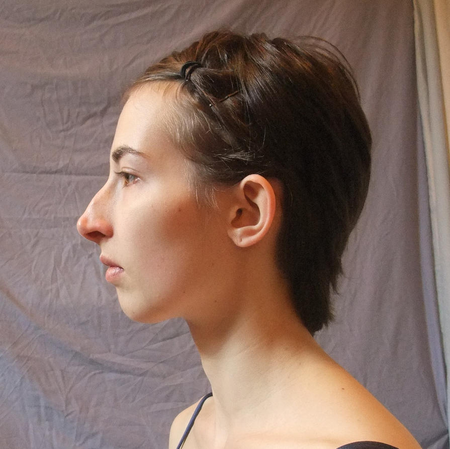
See where the back edge of the jaw is, just in front of the ear? It’s not in front of the neck, not behind, but halfway between, or closer to the front, even. And I think the front of the jaws should be a little lower, too, but it’s the back that’s really throwing them off.