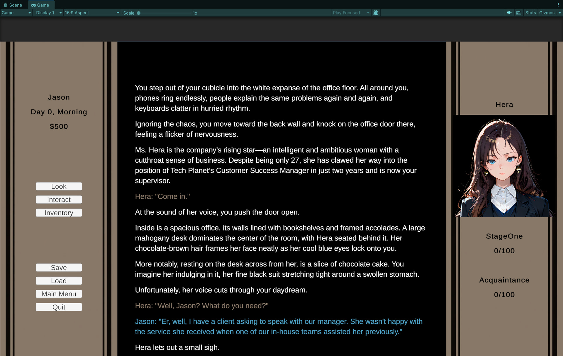
Heeey, I’ve been lurking here for a while and have finally decided to start prototyping a game for a forum
The concept is, the player character is a down on his luck IT grad who gets a new job working as the Lead Host on a crew ship. On that ship, he meets girls named after and loosely inspired by Olympian goddesses, who he will be able to pamper and plump up. I’m also taking some light inspiration from the Argonauts
Mechanics wise, I know I’d like for this game to be something a touch simpler as this is my first time developing a game for a fetish. I am also not an artist and am not ready to make a commission, so I’m leaning into my strengths as a Unity programmer and am developing this game as a Text Adventure game (with AI generated headshots for leading ladies)
The gameplay loop will involve the main character exploring the cruise ship, acquiring items, and gifting them to trigger events that will increase a stat (girl weight, girl affection, or money). This in turn will trigger new events as thresholds are met and states are changed
I have a screenshot of the game below. Please, tell me what you think of the early visual and overall game concept
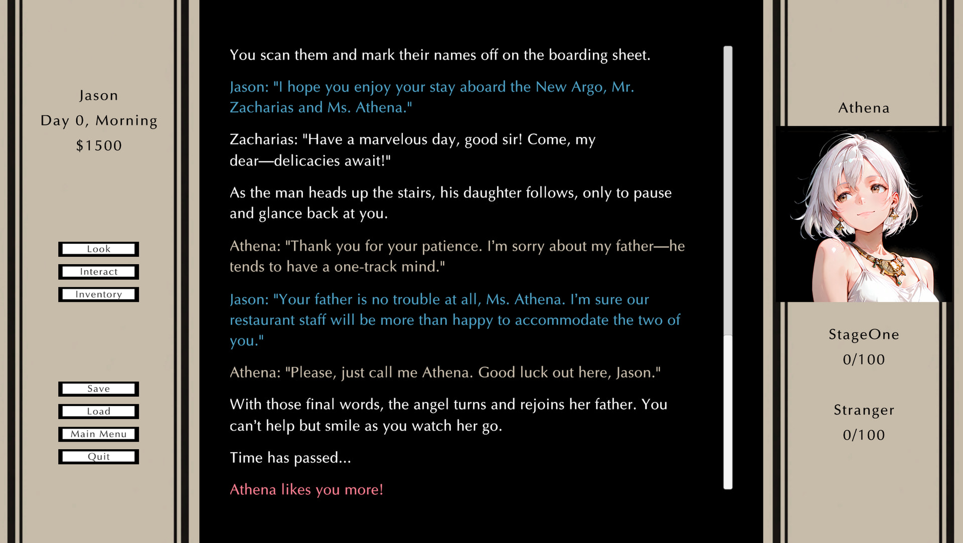
I like the layout and color scheme. The buttons on the left seem serviceable but aren’t really thematically aligned with the rest of the border stuff - maybe a different color scheme or a fancier jpeg/png button system? The font feels fine in the text crawl, but also stands out as ‘not quite right’ on the border material - the banners feel like they’re suggesting a kind of practical regality, which suits “cruise ship” well, but the font choice says “I am presenting data for analysis now” which clashes a bit.
I’m not opposed to AI image generation (I’d be a hypocrite if I were) but it’s important to figure out how to implement a style with it. There’s a lot of “airbrushed minimalist anime ala stuffer dot ai” stuff floating around, which this single headshot you’ve provided seems to lean towards - you might pull more attention if you figure out something that makes people say “Oh, this is a FelBright game” when they see it.
Thanks for the compliments! The project is still early in development so right now I am not set on any particular art style. Most of the assets in the image are placeholders and will likely change as development continues. I do appreciate your suggestion on the font though. Thank you.
At some point I would like to work with an interested artist and get some legit character art. Hopefully, when I have a quality early build ready I can share it with the community and see if an artist would like to work with me at that point.
Totally subjective take : I like the new font for the border! I think the brighter ‘banner color’ draws the eye away from the central text where most of the gameplay is occuring, though, so I don’t think that’s necessarily an improvement.
The buttons on the left feel a little more natural, but still a bit off. Maybe it’s that they have a distinctly horizontal feel while the rest of the material is presented in a vertical fashion?