Hello everyone! I’m starting to go on the move for the Ambitious RPG I posted a while back (well, a version of it at least), starting by making a whole bunch of art assets. Pixel-art sprites, of course, focusing on item icons, status icons and expanding character icons!
The thing is, I’m still a greenhorn when it comes to sprites and pixel art in general, and I would like some feedback on how good this first batch really looks.
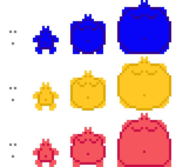
First off, a set of expansion status icons. I’ll freely admit that I was heavily inspired by Rocketshark’s Big Fat Vore RPG, and I’ll gladly change my approach if they seem like too much of a ripoff. Hopefully I made these well enough so that you can tell which is which!
Now, some “action” icons, such as Guard, Attack, Buff, Item, ETC. Also a few icons relating to the expansions stats above.
And finally weapons!
…weapons that I’ll probably redo anyway because my intended aesthetic for the game is more tropical and ISN’T medieval swords 'n sorcery.
Any criticism, tips and advice are welcome!
2 Likes
Seems fine to me, however the expansion status can be a little hard to figure out unless you look for the fine details, but other than that, that’s all fine.
Action icons are pretty self explanatory, there is no confusion there, now as for the weapons, this is where it’s a little muddy, it seems like the resolution for them makes it a little hard to discern them, but it’s not impossible, however, that could very well be from the upscaling giving it difficulty, unfortunately, I am no good when it comes to tips on pixel art, even what I offer on this site, I consider meh compared to the awesome stuff offered here.
My recommendation would be to go for a slightly bigger resolution so that you can go for better looks, or possibly use a software dedicated to sprite art like Aseprite.
But hey, for someone being new to pixel art, I’d say that’s a good batch despite the issues I stated and the limitations icons have in general, mainly the resolution limitation.
1 Like
I’d say they’re distinctive enough.
Maybe could use a little more polish on the expansion icons, but you’re on the right track with the colors.
1 Like
Thank you very much! I’ll try and upscale the weapons in particular so readability isn’t as much of an issue.
Thank you! Is there any particular form of polish you had in mind?
Hmm. Well…
Stage 1: All icons appear to be the same. I don’t know if there’s really a lot of room for them to become more distinct. The color’s probably good enough, I guess. With how big the later icons become, though… Perhaps you could do something with that outside space? Motion lines suggesting particular growth?
Stage 2: A couple of these appear a bit square… But otherwise fine. With the added real-estate you’ve got, perhaps you’ve got room to differentiate them with some detail?
-Blue might like a bit of dithering at the bottom of the gut to suggest a build-up of juice, and perhaps a bit of leakage.
-Yellow might like some stretch-marks to suggest over-taxed skin, and perhaps a bit more rounding at the face, if you think that could look good.
-Red’s a little tricky. Perhaps a few lines in the middle of the gut to suggest creasing/formation of folds? Maybe a deeper navel?
Stage 3: Stage 2 suggestions, but more pronounced. Blueberry leakage is a must here, if not added to Stage 2.
Some ideas, anyway.


