Hi, first time poster here. Have some minor experience fooling around with game engines in the past as a wee lad, but nothing serious beyond making basic minigames that have been lost to desktops of old.
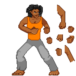
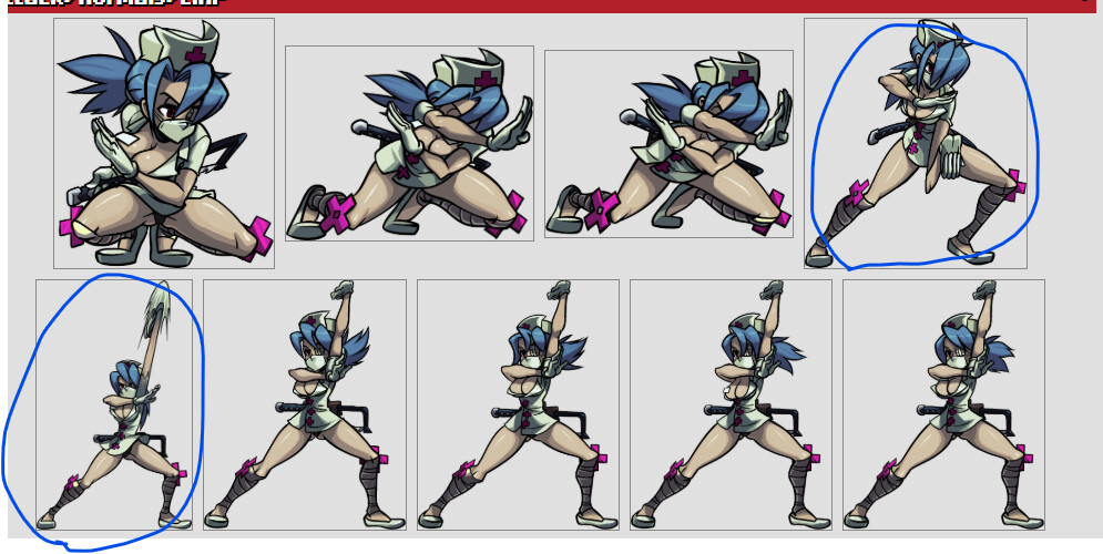
One area I never ever got the hang of was spriting, as the best I could ever muster was amateur edits of Mega Man sprites. This is me trying to roll up my sleeve and learn. I’ve done research, watched videos, etc., and I’ve looked at examples both official and fanmade. Here’s a rough attempt at a I’ve been working on in my spare time to/from work using a free mobile pixel art program (Pixel Studio):
I used SF Alpha Ryu as a heavy reference (most noticeable in the legs, I think), but I avoided doing any tracing except to get a sense of limb anatomy at the start. I must confess that I used a tiny bit of gen AI to make example pixel art of dreads; I discarded it after studying the result so I could practice on my own. I’ll admit that I still struggle with a bunch of stuff: my coloring for fabric is still beyond shoddy, fists feel off with so many attempts on the side, torso feels like a flat misshapen block with misaligned breasts pasted on, etc. Any critiques on my shortcomings would be most welcome.
I am posting this here as opposed to a more general sprite community or M.U.G.E.N. community because while it may seem innocuous now, I do intend to eventually work my way up to more ahem ROUND bodies. I’d rather get feedback in a community that lines up with my preferences from the start.
For fighting game sprites I’d start out with doing basic studies of posing, taking existing sprites and either copying or tracing over them with basic rectangles, triangles, and circles. With how few frames you get for controls that feel responsive it’s very important to convey the maximum amount of information with your poses so they can be read cleanly and quickly. Find a move you like and try to identify the three key frames:
Neutral: easiest to figure out since it’s just the default state of the character, the most important thing to pay attention to is how it contrasts with your other poses.
Windup: the pose that indicates a move is about to come out, sometimes faster moves have little to no windup but most do. Important things to pay attention to are where it looks like the hitbox is about to be, how powerful the move looks like it’s going to be, and how that information is conveyed. Is the pose distinct enough from the neutral position to tell them apart in a split second of reaction time?
Impact: when the move actually hits, how does its hitbox line up with the visuals? Is it clear where the hitbox is? How distinct is it from the windup and the neutral so that people know when it’s safe to approach again?
There’s a ton of other to consider for strong posing in general (line of action, balance, etc.), but for fighting games specifically I’d say that’s a good place to start. Hell you can even look to Kazecat for some inspiration with Crushing Force, they’ve done a great job at adapting larger bodies to fighting game mechanics and visuals.
I’m still learning myself, so take my feedback with a pinch of salt. That said,
You don’t need to draw all the fingers explicitly. Highly detailed areas pull the eyes and make any mistake obvious. Moreover they take the focus away from the pose, which is more important to the game.
Pay more attention to the proportions. Even if you go for stylized proportions and your arms and legs are longer on purpose, the arm should be about the same length as the forearm. If it supposed to be moved to the front, then the triceps should be drawn differently. You did a good job with the left hand, where the arm is in the shadow, making the forearm to look closer to the viewer.
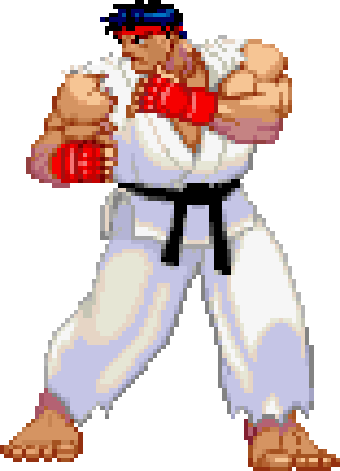
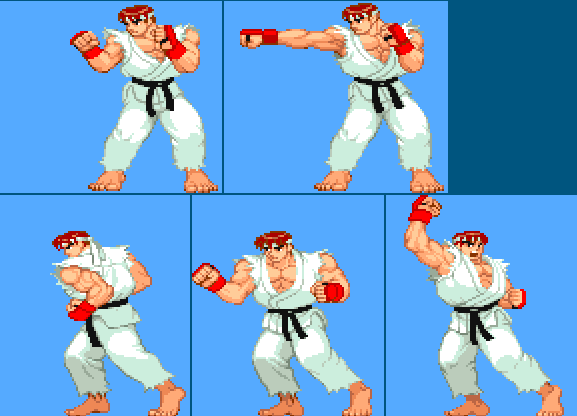
Scaled down to about the size you’d see on screen, the main things most folk immediately notice are the gloves, the belt and the headband, more or less in that order. Add in the movement of his idle and the details get even more “lost“ into the general feeling of his bouncing. Not to say the details don’t matter, but that they aren’t the priority for sprites in fighting games.
The main details they emphasized for Ryu here are his stance and big muscles. He feels solid but nimble, thanks to the idle, and prepared for the fight. But he doesn’t feel like a wall of muscle, at least not compared to Zangief.
And since you mentioned the fists as a struggle point, have a look at how capcom “cheated” the hands. They love adding some kind of gloves, bracelet or other clothing piece, largely to act as a target to follow when in movement. And in Ryus case, they also hide most of the hand except for the fingers. Additionally with his right hand, there is a very distinct differences in width of the fingers, with the index being 4 pixels wide and the pinky 2, counting the darker “in-between” pixels.
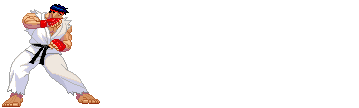
I’d like to give an example of keyframes, just to add on to what Chubberdy was talking about. In SF3 the best example from Ryu is the fireball, with it’s very distinct wind-up, “impact” when the projectile is spawned and follow through as his clothes settle and he eventually goes back to idle.
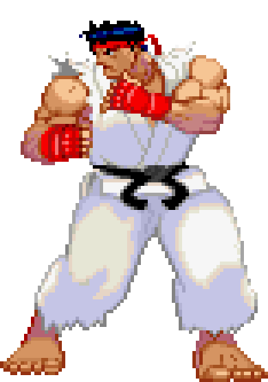
Lastly, SF3 Ryu has a much beefier build than your art but I chose this because he’s rather exaggerated can help in fighting games but if you want to look at some examples closer to your proportions, my recommendations would be SF3 Elena on wiki.supercombo.gg or half of the melty blood type lumina roster on mizuumi.wiki. Best of luck and I hope my rambling is helpful
I’m not really an expert in making sprites, but I know a thing or two on some principles.
For a character, is important to emphasize visibilty when doing attacks or movement, as you have to think about how a player will see them. In SF, they make the characters limbs bigger and they wear clothes that make their physique stand out. In KOF, they more realistic proportions but use more animation frames and effects like blur to make moves more visible. I say this because a problem that affects some games (especially the MK games) is that characters may blend with the background or their moves are almost invisible to players. Think about that when designing a character and their animations and a good way to check is by looking at a sillhoute of their character in motion. Another thing is to look at your sprite through greyscale to see if you can determine well the colors, so that they don’t blend each other.
Another thing is that, don’t be afraid of “breaking the character”. They don’t have to be realistic, but to sell and make you feel the “illusion of movement”. An example of that is here with Valentine from Skullgirls.
In these frame, you can see that her arm literally stretches and breaks, but in motion you don’t really notice this and it makes it look much better and fluid. Also, you don’t need to make a lot of frames, if you have saw other animations frames of characters sprites you’ll notice that they don’t really have that many for certain actions and is because your brain fills the gap when you look at them
It’s worth noting that from what was shared, Street Fighter has a few more tones when it comes to shading and color, as well as its color compression / limitation or imitation of which causing yellowish shades to appear around the shadows, as well as black hair being bluish. This color shift is very important even when not going for a retro aesthetic. Though in that case we might not see dramatic color shifts like yellowish shades in the midtones. Like all things , this would also probably improve the look when things go in motion.